
Open OA: Collaborative Design Approach
In this case study, I outline my approach to creating logos, technical diagrams, and information graphics that support clarity, alignment, and strategic communication. I take a collaborative approach and partner closely with clients and project stakeholders throughout each phase of the creative process. With multiple checkpoints built in, this ensures everyone is aligned on goals, audience needs, and accuracy before a final solution is developed. This results in visual solutions that tell a clear story, are purpose driven, resonate with audiences, and drive results.
Logo Design: Discovery and Sketches
Open OA is an open source framework from the National Renewable Energy Laboratory (NREL) that promotes transparency, consistency, and standardization in wind farm operational analysis.
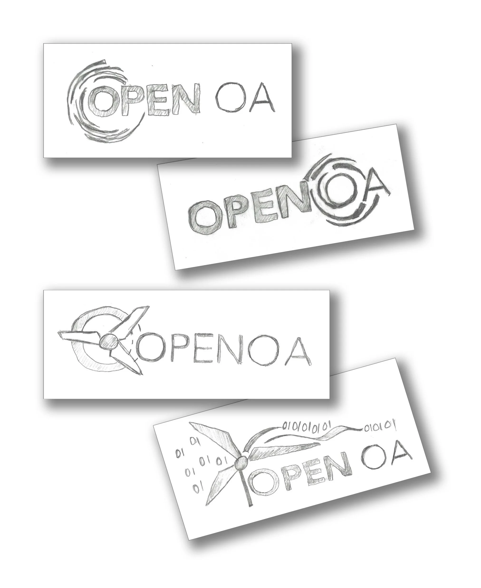
In this early phase of the logo development, I met with researchers and key stakeholders to understand the project objectives, the underlying technology, the intended audiences, and how the logo would be used across communications and public facing materials. Once I gathered this information, I created rough sketches that reflected the ideas discussed in our initial meeting. These early concepts served as a collaborative checkpoint to confirm we were aligned and moving in the right direction. This also provided an opportunity to pivot quickly if needed before investing time in a design that was not aligned with the client's vision.
Creating a Digital Mark
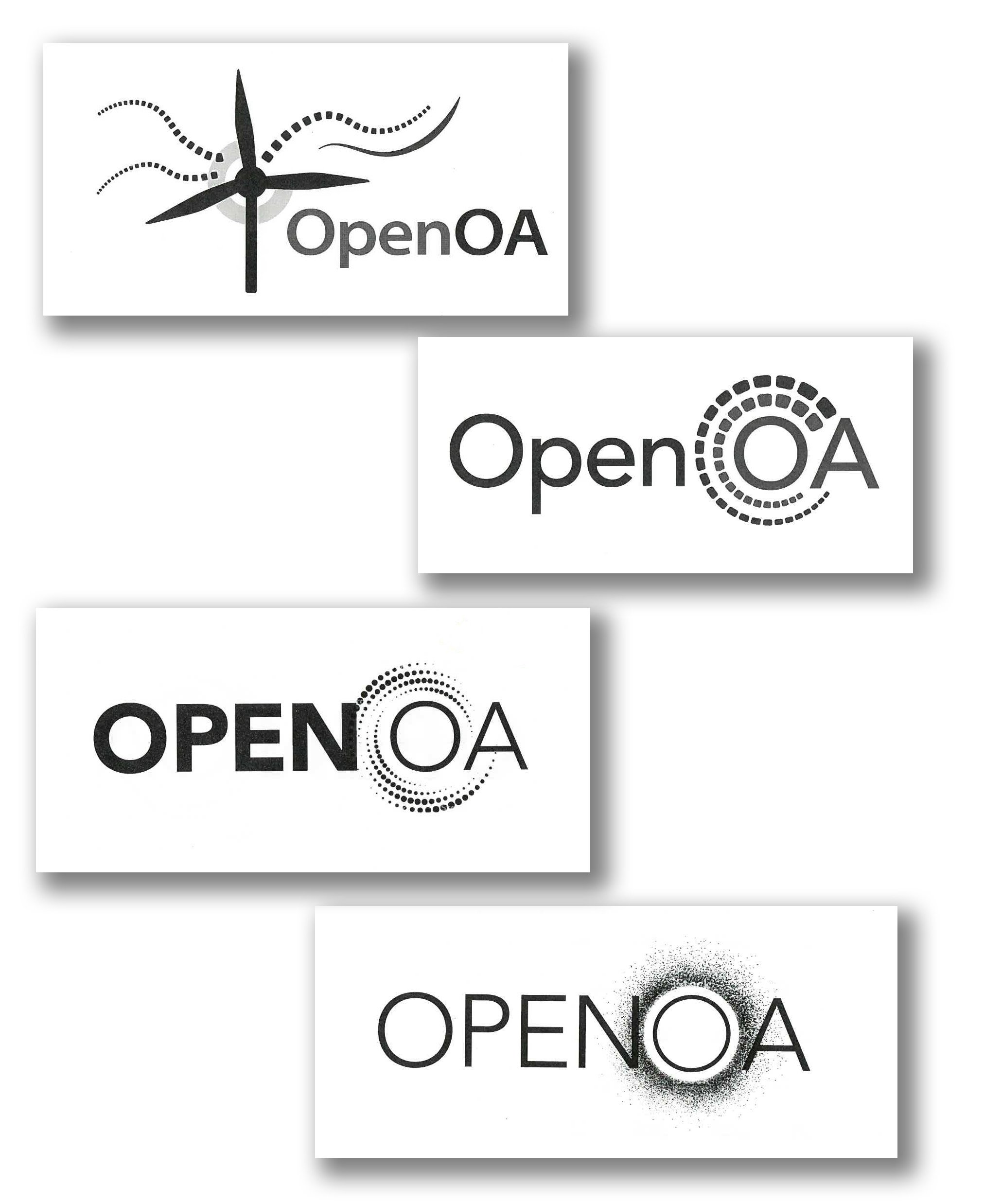
After reviewing the initial sketches, the client shared several key points of feedback. They did not want to use binary code to represent data, and they preferred not to include turbine blades within a circular mark. They felt that a wind turbine paired with data streams was too busy and expected, but they were open to exploring that version further. What resonated most was the idea of using the letter O as a graphic element with a wind current to symbolize wind data and measurement. After talking through the sketches and clarifying their preferences, I moved into the next phase, where I developed simple digital marks that reflected their vision and incorporated the initial feedback.
Based on these initial digital marks, we decided to eliminate the wind turbine. The client also preferred using squares rather than circles to represent data and requested a version where the rings around the O were continuous rather than segmented. We also agreed that highlighting the O in OA created a stronger connection to the technology and the concept of operational assessment.
Refinement and Color Exploration
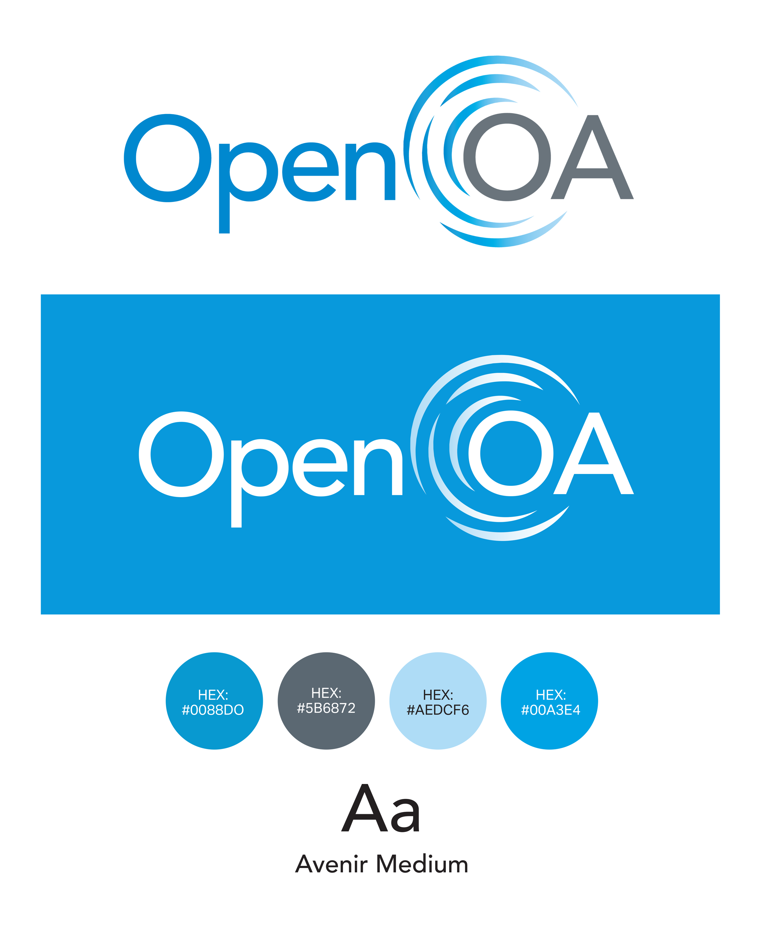
During the next phase, I created an additional option that reflected the request for continuous lines rather than segmented data elements. I also added color to the two strongest concepts, since we had clear alignment with the client on both directions. Because this program is part of the National Renewable Energy Laboratory initiative, the design needed to follow the approved NREL color palette. Blue and green were selected because they best represent wind, nature, and clean energy technology.
During this phase, I also explored typefaces within the NREL brand standards. Avenir was selected for its clean geometric forms, rounded character shapes, and wide range of weights. We also decided to use upper and lowercase lettering because it created a more aesthetically pleasing, organic, and fluid look. These qualities support strong hierarchy, clear readability, and a modern technical style that aligns well with the Open OA brand and complements the circular elements of the logo.
Once these refinements were complete, the two logo options were presented to leadership and the broader team for review and feedback.
Final Color Exploration

The preferred option was selected and approved by all key team members. Before finalizing it, we explored several color variations to ensure the mark aligned with the program’s purpose and visual guidelines. Once the color direction was confirmed, I moved forward with developing the full set of logo versions needed for different applications.
Final Logo and Color Direction
The blue color was selected, and the logo was approved by the team. At this point, I finalized the color values and began building out the necessary logo variations. This included the full color version as well as a reversed option for use on dark backgrounds. Creating multiple logo formats, such as four color, one color, and reversed versions, ensures the mark remains clear, consistent, and recognizable across a wide range of applications. These variations help maintain the integrity of the brand and support strong, long term brand recognition.
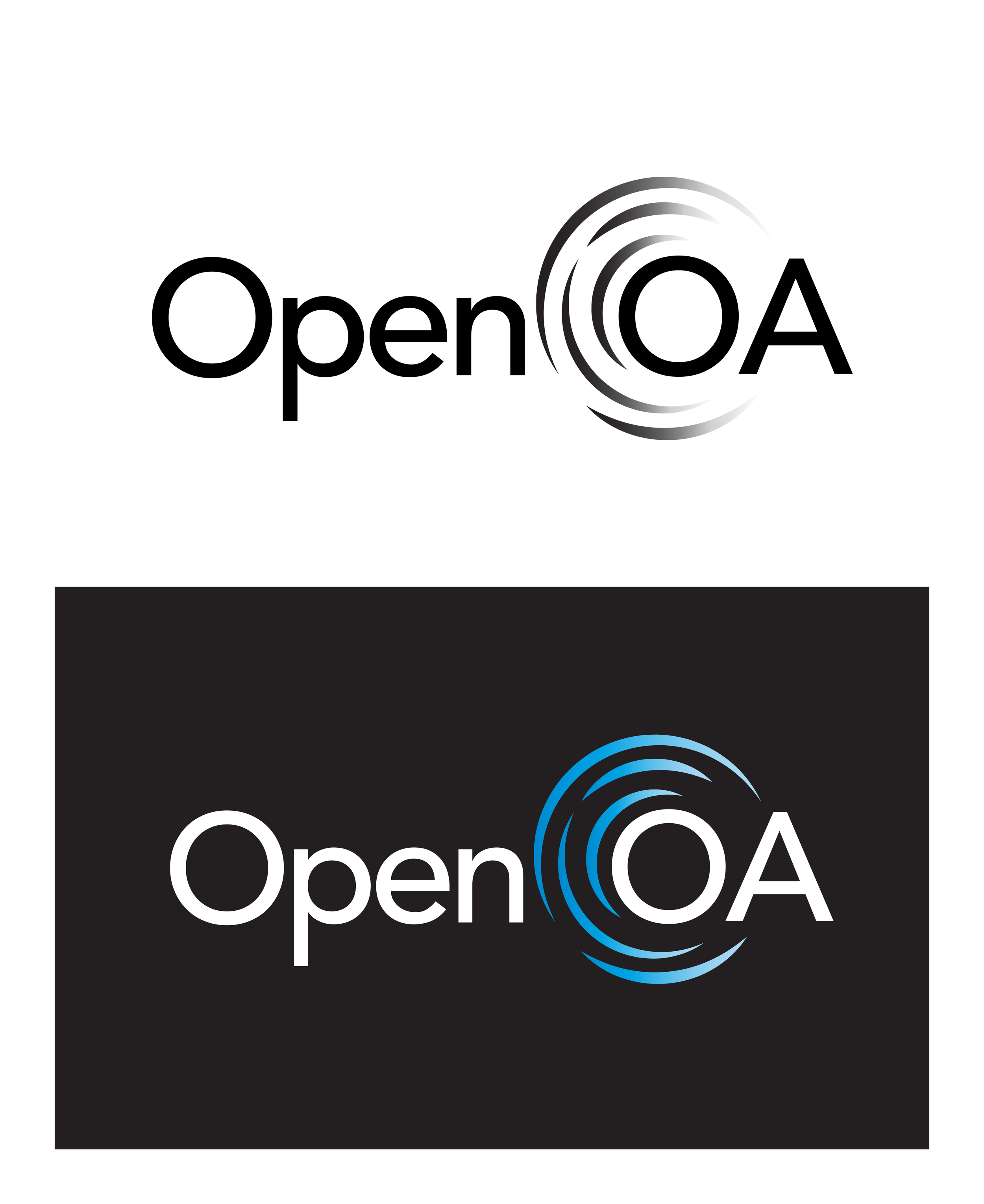
A grayscale version was created, and I explored additional applications of the reversed logo to ensure it remained clear and readable on a wide range of backgrounds. Developing accessible logo variations, such as one color, grayscale, and reversed formats, is essential because logos often appear in environments where full color is not available or where visual contrast must be optimized. These variations help maintain readability for all audiences, support compliance with accessibility standards, and ensure the logo remains consistent in technical documents, reports, presentations, and print materials. Testing each version against different background colors confirmed that the mark remained strong, legible, and accessible in every application.
Ensuring Legibility and Accessibility
Establishing the Image Style
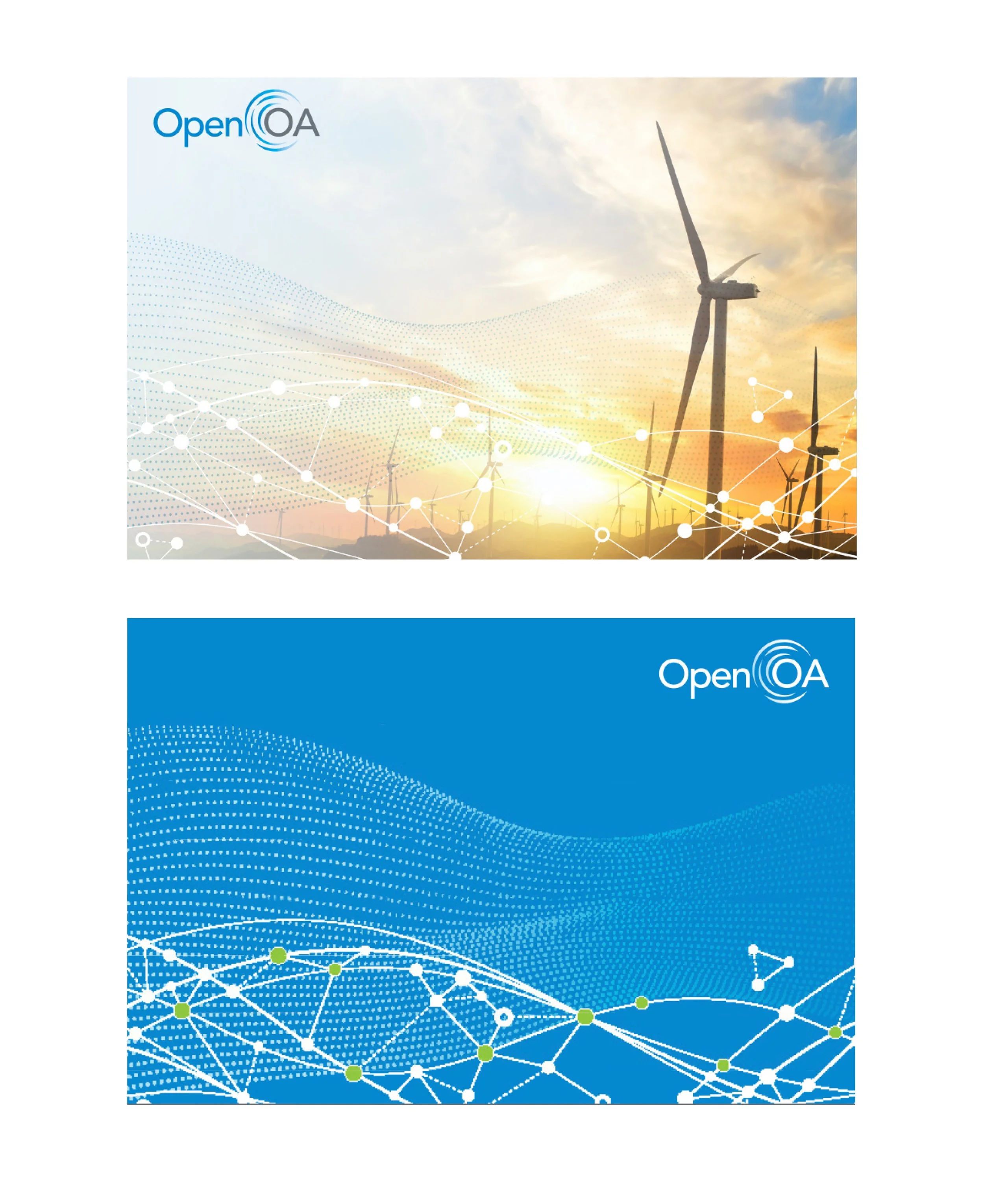
To complete the brand foundations, I created sample images that demonstrated a recommended image style and showed how the visuals complement the logo and reinforce the program’s objectives. Establishing a consistent image approach is an important part of building a cohesive visual identity. These samples help guide the overall look and feel of future materials, support visual consistency, and provide teams with clear direction as they create reports, presentations, and digital content. With the logo, color palette, image style, and accessibility considerations in place, the brand now has the core building blocks needed for strong and effective communication.